Creating Stunning Real Estate Flyers that Convert
24 March 2026
Let’s be real—when it comes to real estate marketing, first impressions are everything. Your flyer isn’t just a piece of paper; it’s your golden ticket to impress potential buyers, snag leads, and make those sales happen. But, let's be honest, not all real estate flyers are created equal. Some end up in the trash faster than you can say "curb appeal," while others demand attention and get results.
So, how do you ensure your flyer falls into the latter category? Buckle up because we're diving into the art (and science) of creating stunning real estate flyers that actually convert.
Why Real Estate Flyers Still Matter
In a world drowning in digital ads and social media posts, why bother with a physical flyer? Simple—because they work. A well-designed flyer gives potential buyers something tangible, something they can hold, skim through, and keep. Plus, they’re an excellent way to target local buyers and generate more foot traffic to your listings.But here’s the catch—your flyer has to be top-notch. A boring, generic flyer with a slapdash photo and uninspiring text? No thanks. If you want to grab attention and drive action, you need to put in the effort.
Key Elements of a High-Converting Real Estate Flyer
Before we dive into design tips and tricks, let’s break down what makes a real estate flyer truly effective. Here’s the magic formula:- Eye-catching headline – A compelling statement that piques interest.
- High-quality images – Because nobody buys a house they can barely see.
- Engaging property details – Keep it concise yet informative.
- A strong call to action (CTA) – Tell people exactly what to do next.
- Contact information – Make it super easy to reach you.
Now that we’ve got the basics down, let’s take it up a notch.

Head-Turning Headlines
Your headline is the first thing people see, so make it count. A bland "House for Sale" isn’t going to cut it. Instead, go for something that stirs emotion or excitement.Examples of attention-grabbing headlines:
✅ Dream Home Alert! Stunning 4-Bedroom Oasis with Ocean Views!
✅ Move-In Ready & Priced to Sell – Don’t Miss Out!
✅ Luxury Living at Its Finest – This Home Won’t Last!
Think of your headline as the hook that reels people in. If it doesn’t pop, they’ll just move on.

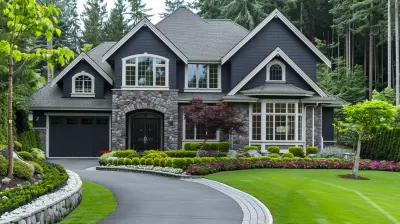
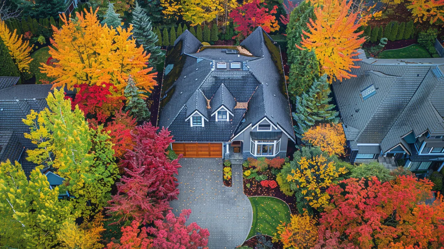
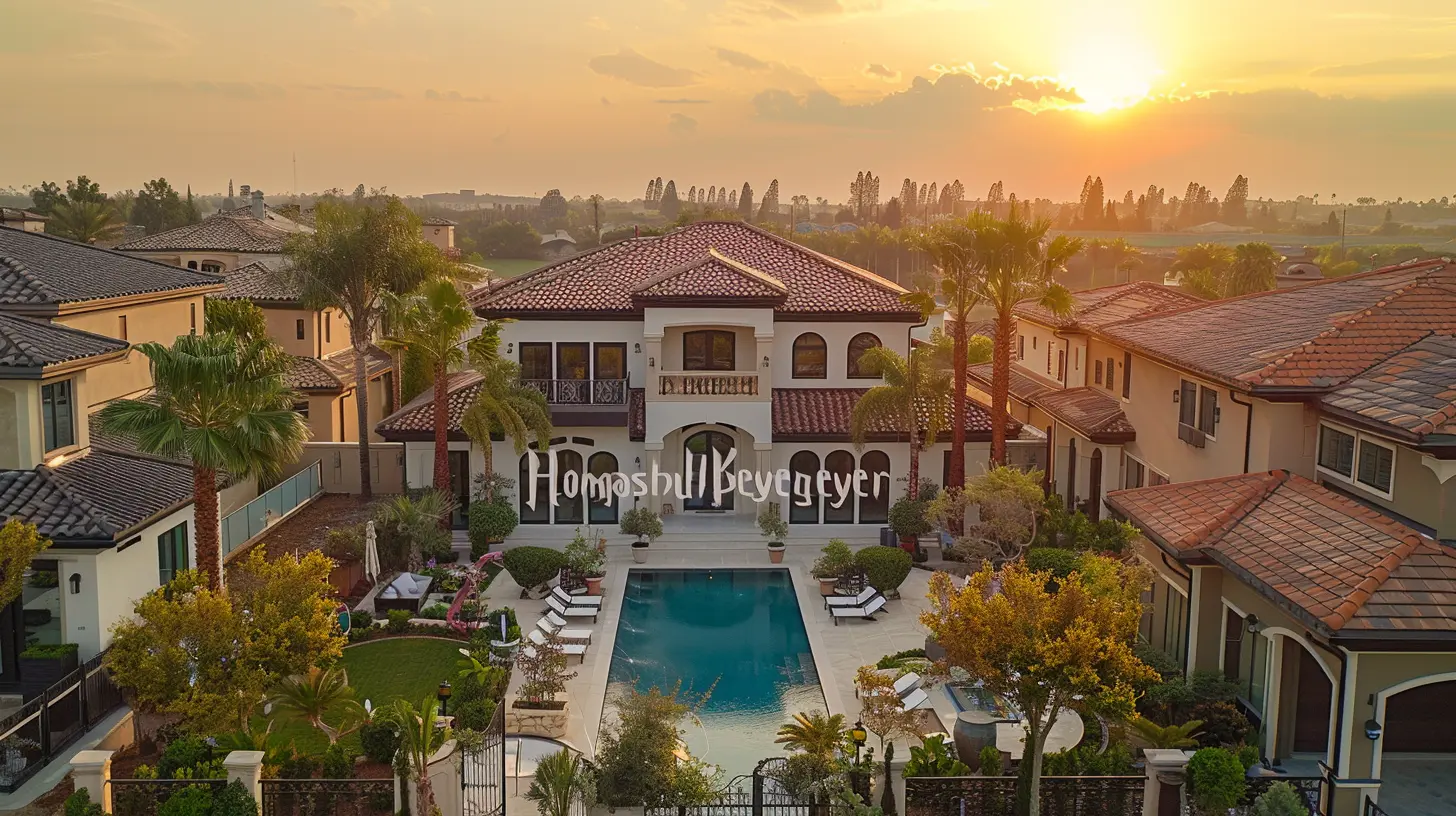
The Power of Stunning Visuals
A picture is worth a thousand words, but a bad picture? It’s worth exactly zero leads. Your photos should be high resolution, well-lit, and showcase the best features of the property.Pro Tips for Flyer-Worthy Photos:
- Use natural light to make spaces look bright and inviting.- Capture the main selling points (think: gourmet kitchen, spacious backyard, luxury bathroom).
- Avoid clutter—remove unnecessary items before snapping pictures.
- If possible, hire a professional photographer. Trust me, it’s worth it.
Your flyer should have at least one stunning hero image—something that makes people stop and stare.
Crafting a Killer Property Description
Nobody wants to read a novel on a flyer, but they do want details. The key? Keep it concise yet compelling. Paint a picture with words, but don't overwhelm.Instead of this:
"This is a 3-bedroom, 2-bathroom house with a large backyard and an open floor plan."
Try this:
"Step into this stylish 3-bedroom, 2-bathroom home featuring an open-concept layout, sunlit living spaces, and a spacious backyard perfect for entertaining."
See the difference? One sounds meh, and the other sells a lifestyle.
Must-Have Property Details:
✔ Square footage✔ Number of bedrooms/bathrooms
✔ Special features (fireplace, pool, smart home tech, etc.)
✔ Location highlights (near parks, schools, restaurants)
Keep it engaging, and always make it about the buyer’s experience.
The Call to Action (CTA) That Seals the Deal
Here’s a shocking truth—if you don’t tell people what to do next, chances are, they won’t do anything. Your CTA should be clear, direct, and urgent.- Weak CTA: "For more information, call us."
- Strong CTA: "Schedule a private tour today! Call [Your Name] at [Your Number] before it’s gone!"
Give them a reason to act now, not later.
Design That Demands Attention
Great content is nothing without great design. Your flyer should be easy to skim, visually appealing, and well-organized.Design Tips for Maximum Impact:
✅ Use bold typography – Make headlines and key details pop.✅ Stick to a clean layout – Don't clutter with unnecessary text or images.
✅ Choose brand colors wisely – Keep it consistent with your real estate branding.
✅ Use white space effectively – Let your content breathe; don’t cram everything in.
✅ Highlight key selling points – Use bullet points to make information easy to scan.
And whatever you do, please don’t go overboard with crazy fonts. Stick to 2-3 fonts max—one for headlines, one for body text, and maybe a third for accents.
Print vs. Digital Flyers – Why Not Both?
While traditional printed flyers are still highly effective (especially for open houses and direct mail campaigns), digital flyers are gaining traction. Why not take advantage of both?How to Maximize Digital Flyers:
- Convert your design into a PDF or JPEG for easy sharing online.- Post on social media (Facebook, Instagram, LinkedIn).
- Email to potential buyers and real estate contacts.
- Use QR codes on printed flyers that link to virtual tours or more property details.
A well-executed flyer—whether printed or digital—can make a massive difference in generating interest.
Common Real Estate Flyer Mistakes to Avoid
Even the best agents slip up when designing flyers. Don’t fall into these traps:🚫 Overloading with text – Keep it short and sweet.
🚫 Using low-quality images – Blurry, dark, or pixelated photos are a no-go.
🚫 Forgetting contact details – If buyers can’t reach you, what’s the point?
🚫 Weak CTA – Always guide the reader to take action.
🚫 Poor design choices – Avoid clashing colors, funky fonts, or cluttered layouts.
If your flyer isn’t easy to read and exciting to look at, it’s already at a disadvantage.
Final Thoughts
A real estate flyer is more than just a piece of paper—it’s a powerful marketing tool that can make or break a sale. When done right, it grabs attention, delivers key info effortlessly, and compels prospects to take action.So, the next time you create a real estate flyer, don’t just slap something together—put in the effort, make it shine, and watch those leads roll in. After all, in real estate, it’s not just about selling houses—it’s about selling dreams.
all images in this post were generated using AI tools
Category:
Real Estate MarketingAuthor:

Elsa McLaurin
Discussion
rate this article
2 comments
Alexa McLoughlin
Great tips! Excited to enhance my flyers!
March 31, 2026 at 4:18 AM
Elsa McLaurin
Thank you! I'm glad you found the tips helpful—excited to see your stunning flyers!
Mason McLaury
Transform your listings—great flyers drive sales and success!
March 26, 2026 at 11:24 AM
Elsa McLaurin
Thank you! Great flyers are indeed essential for capturing attention and driving success in real estate.